
pH CLINIC - brand identity
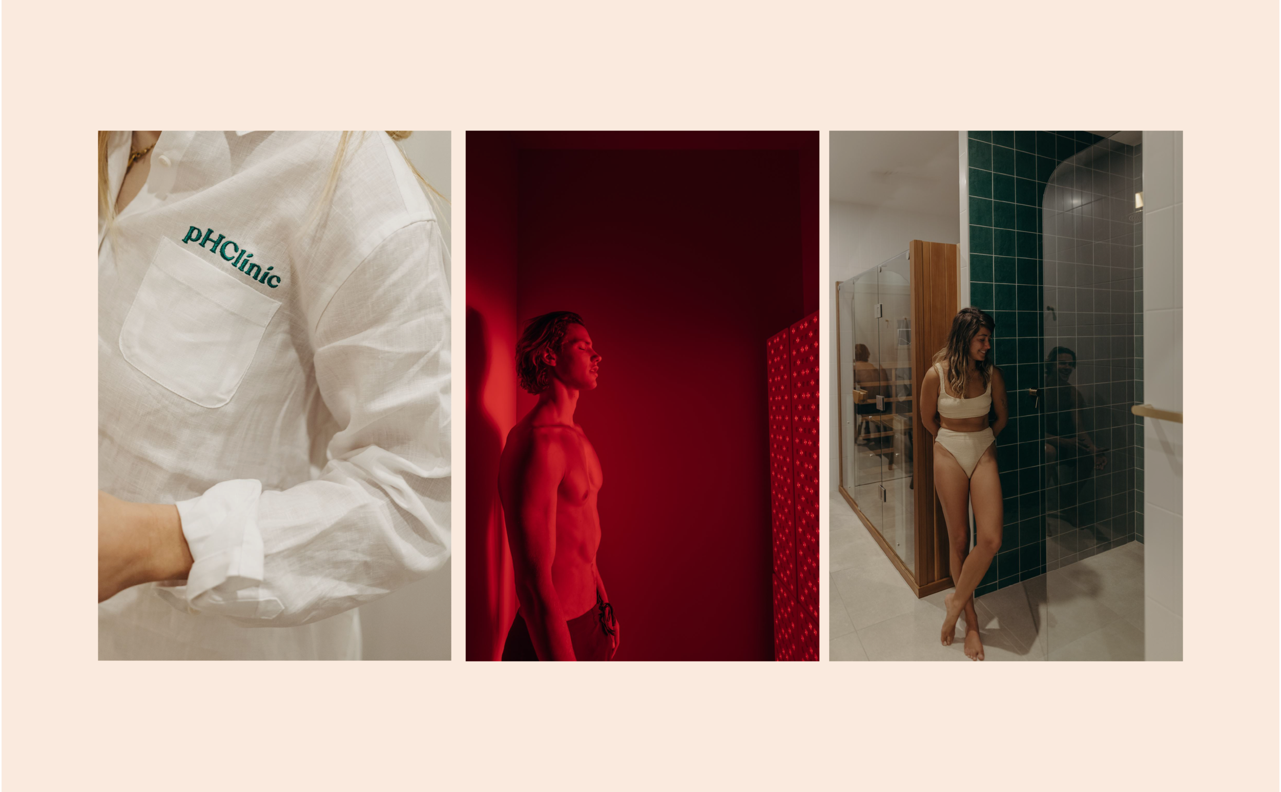
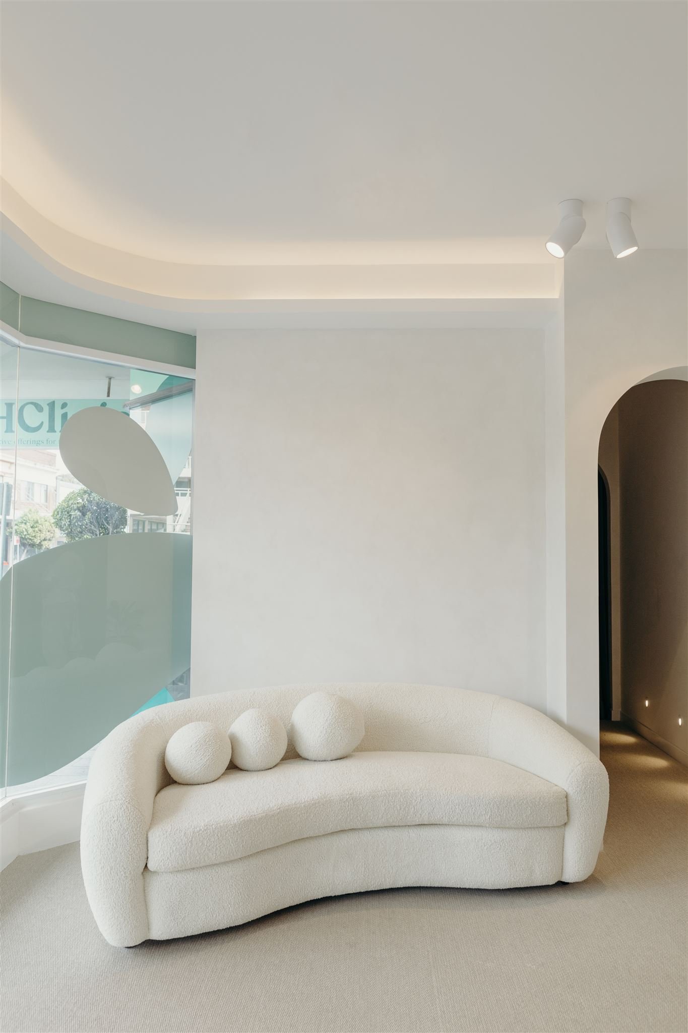
pH Clinic in Manly, Sydney was about to undergo a transformation. The small alternative therapies clinic was moving from a small humble space into a much larger high street premises in the Northern beaches of Sydney. The owner Nichola contacted me to look at how the brand could also transform with the business, as their offerings were increasing. For them the move meant space for new bio-hacking treatments and therapies which were now to be offered in a high vibration setting. Their current brandmark didn’t align with this new offering, so it needed to evolve with the business.
NOV 2020 – ONGOING
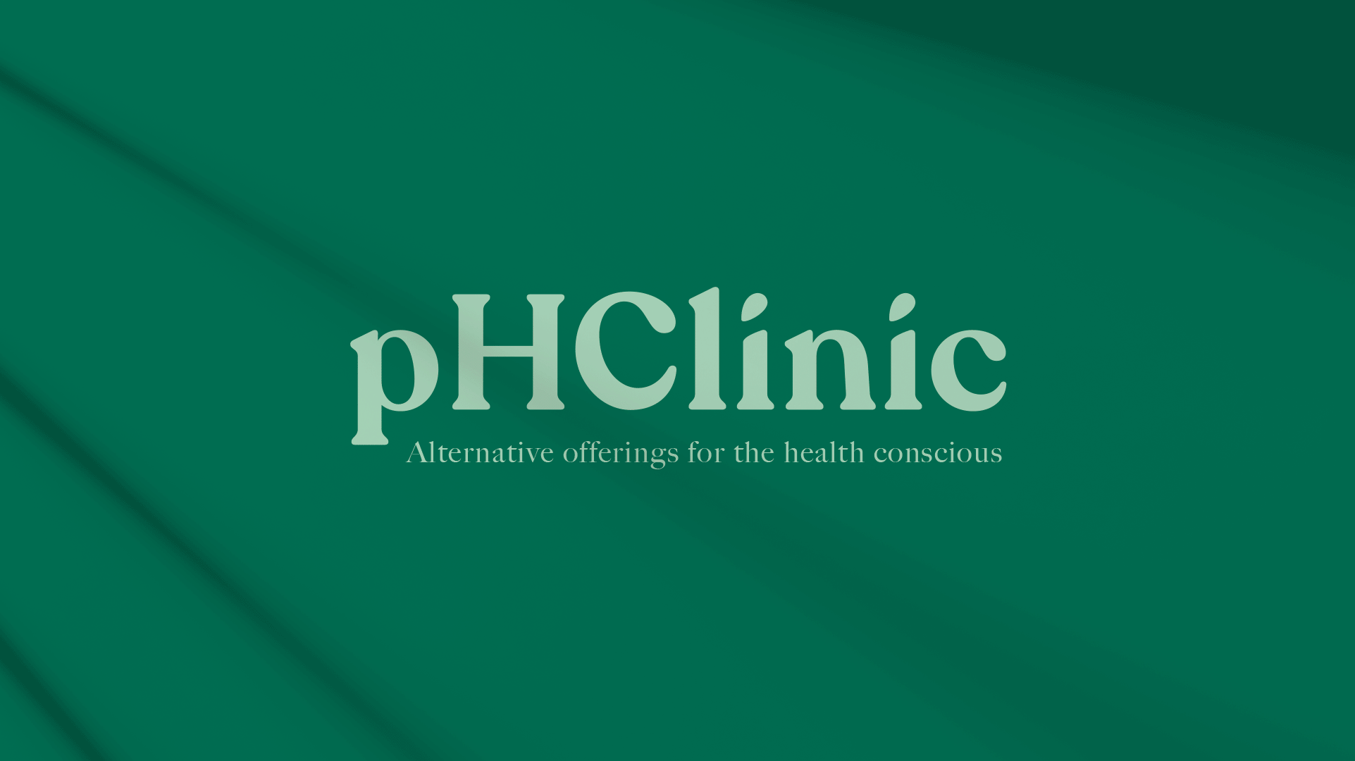
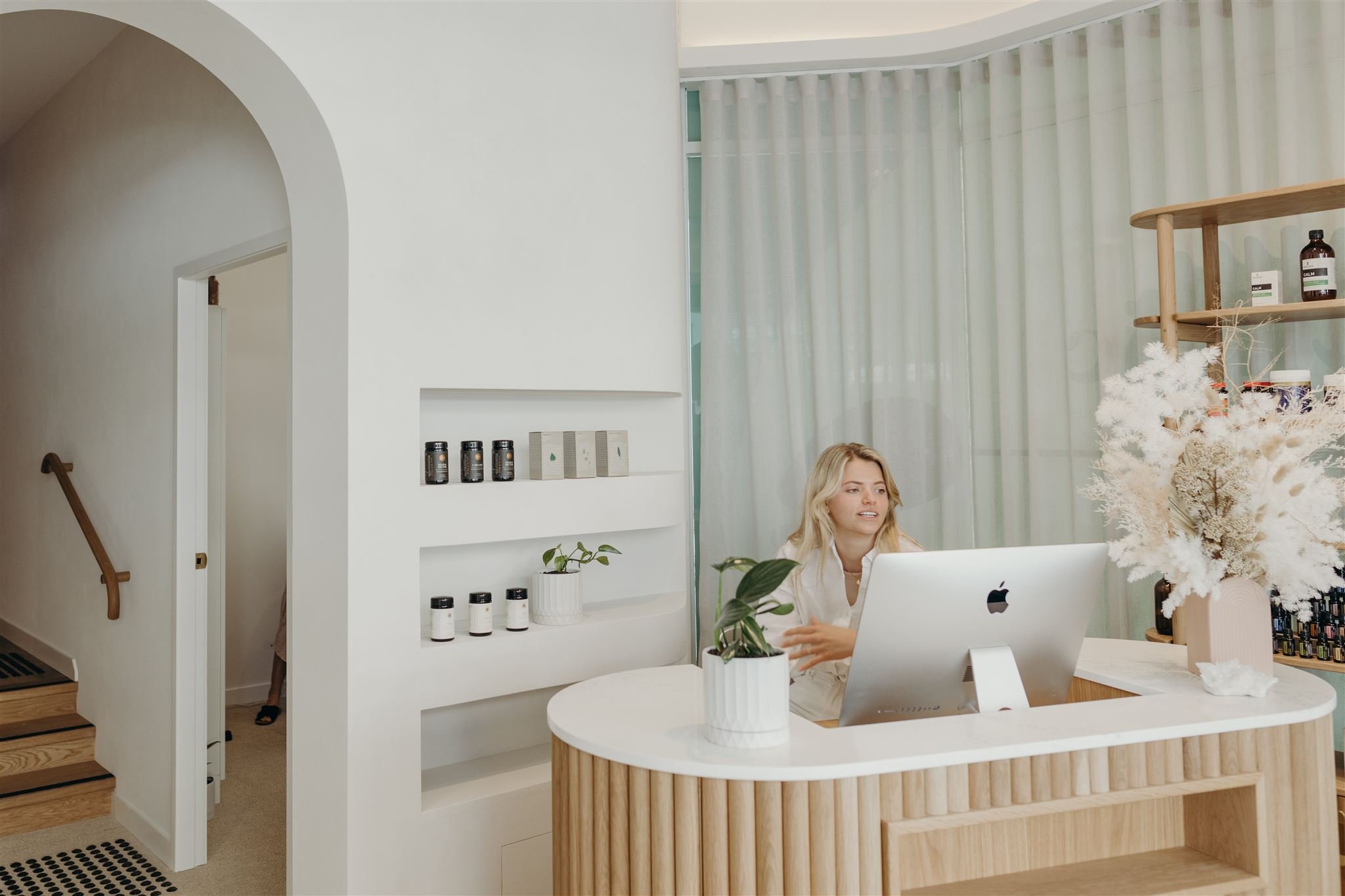
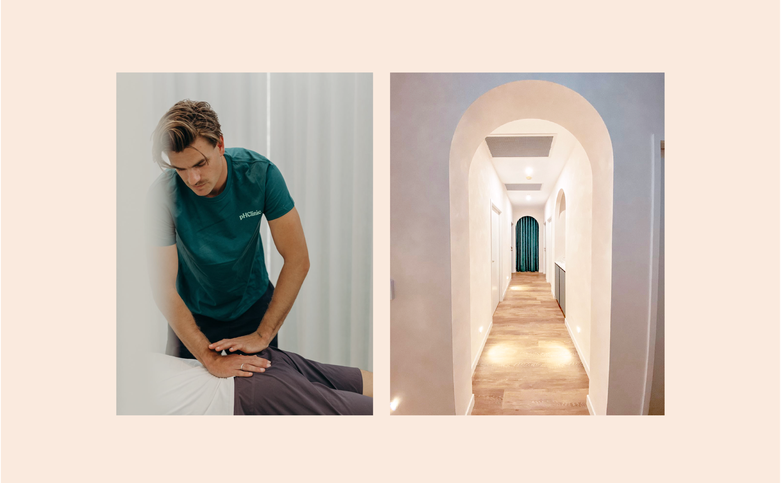
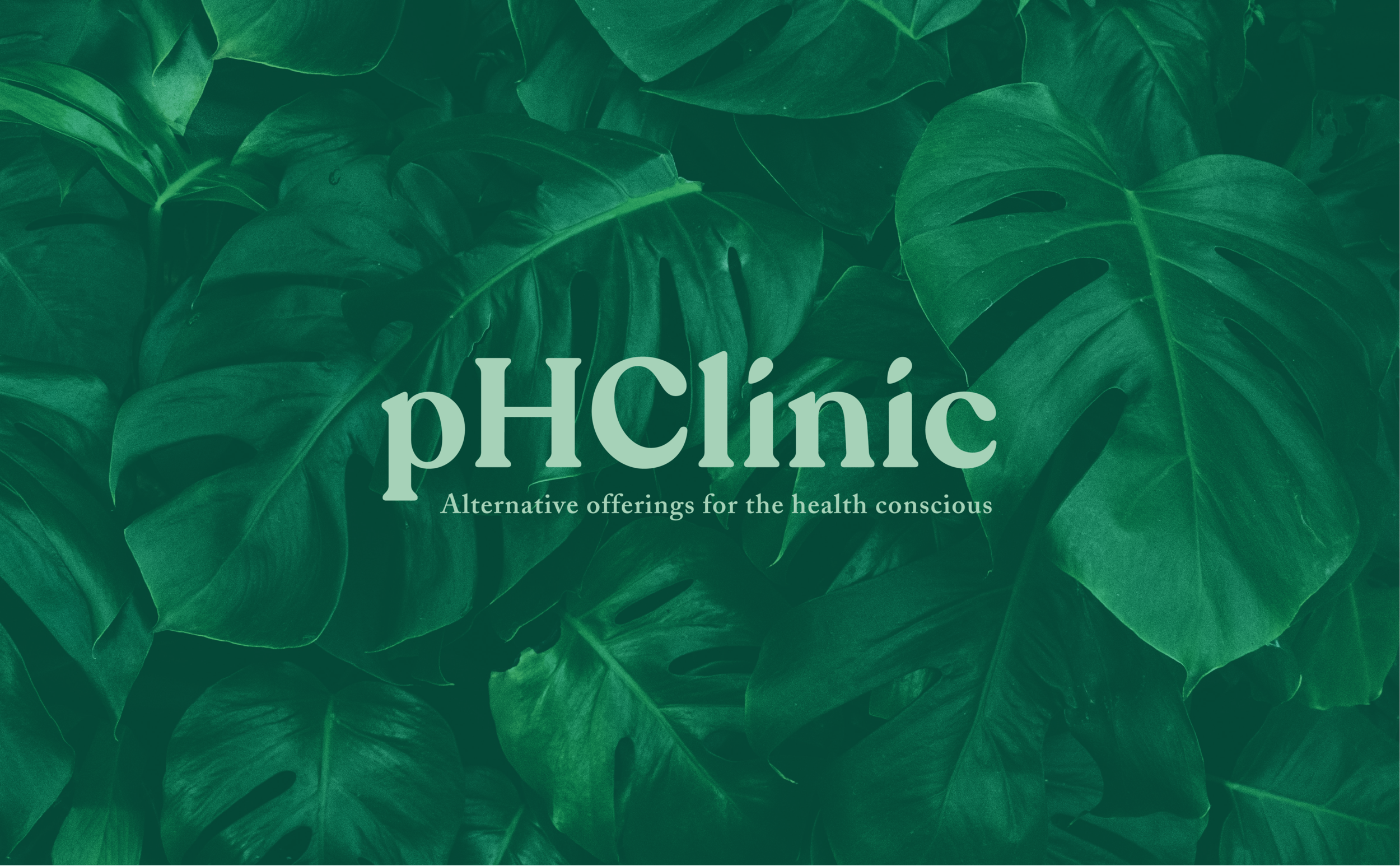
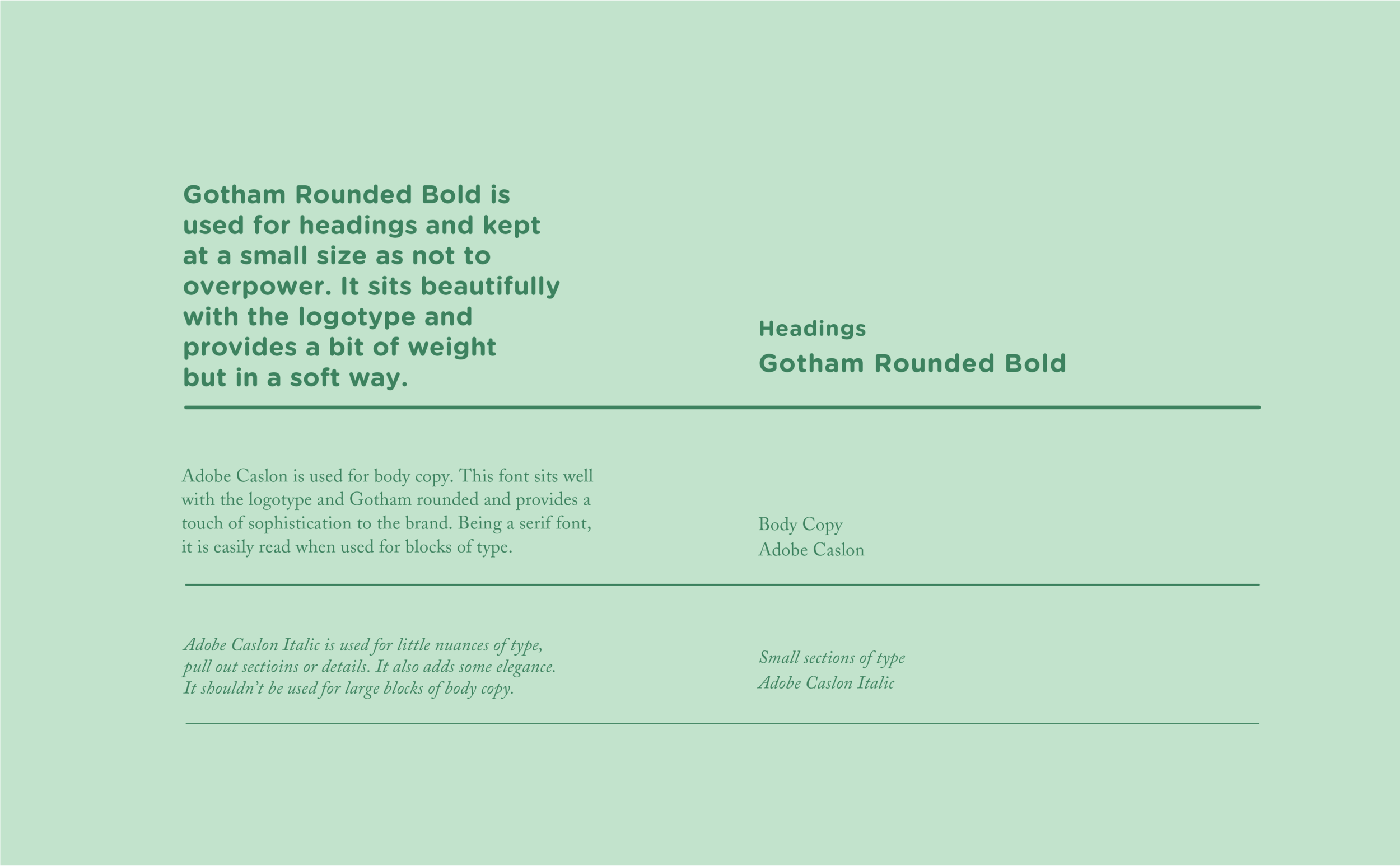
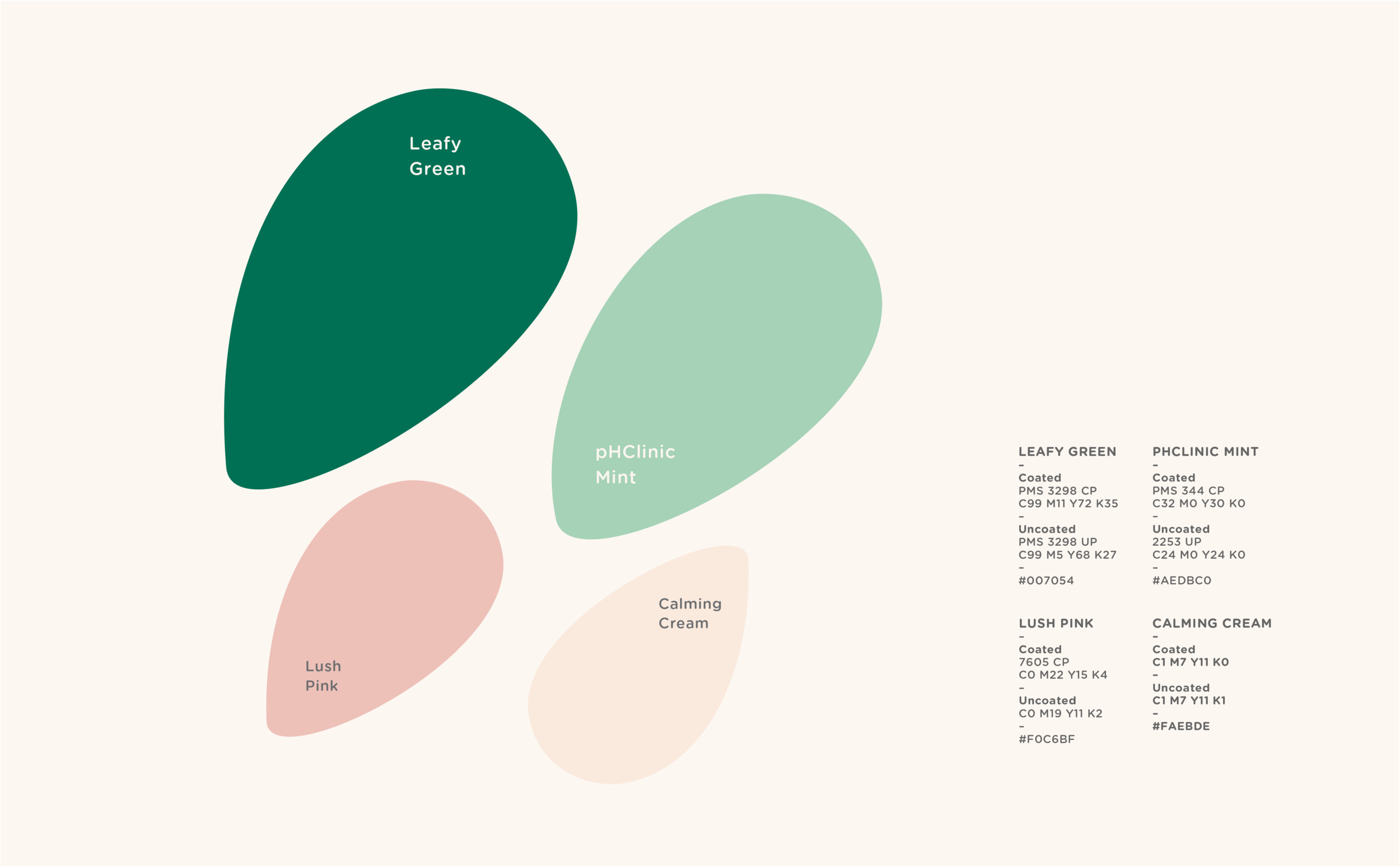
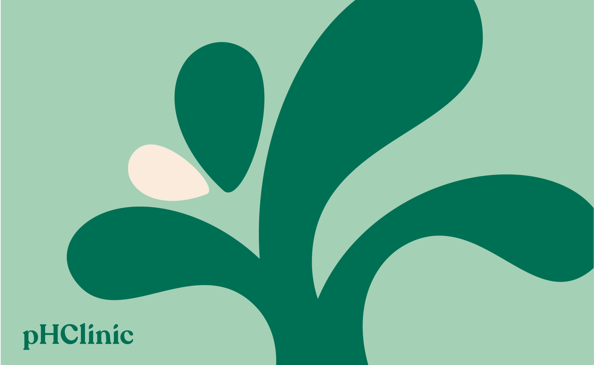
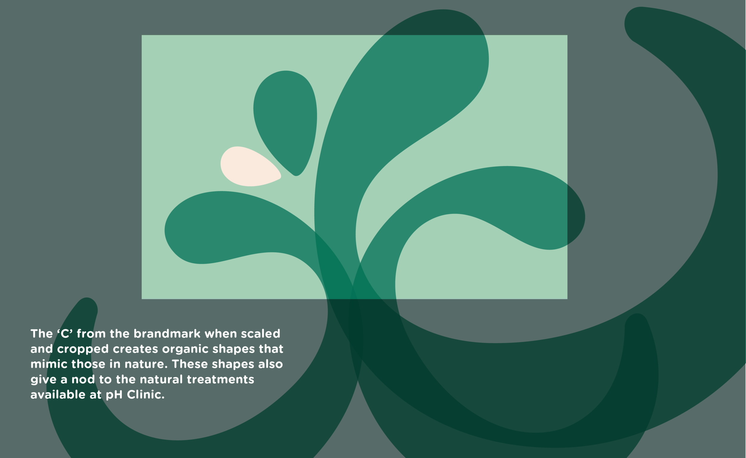
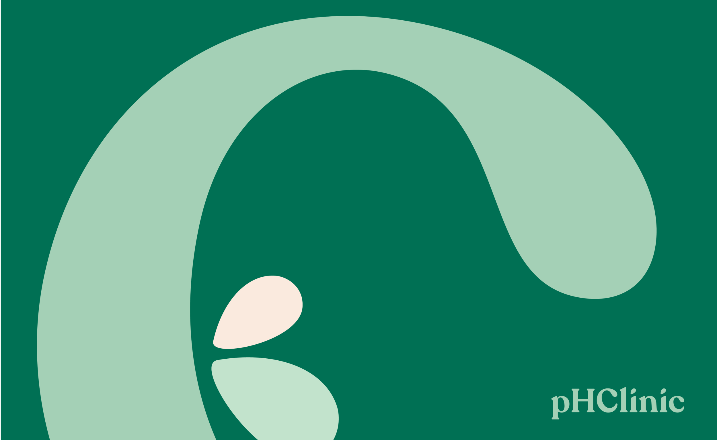
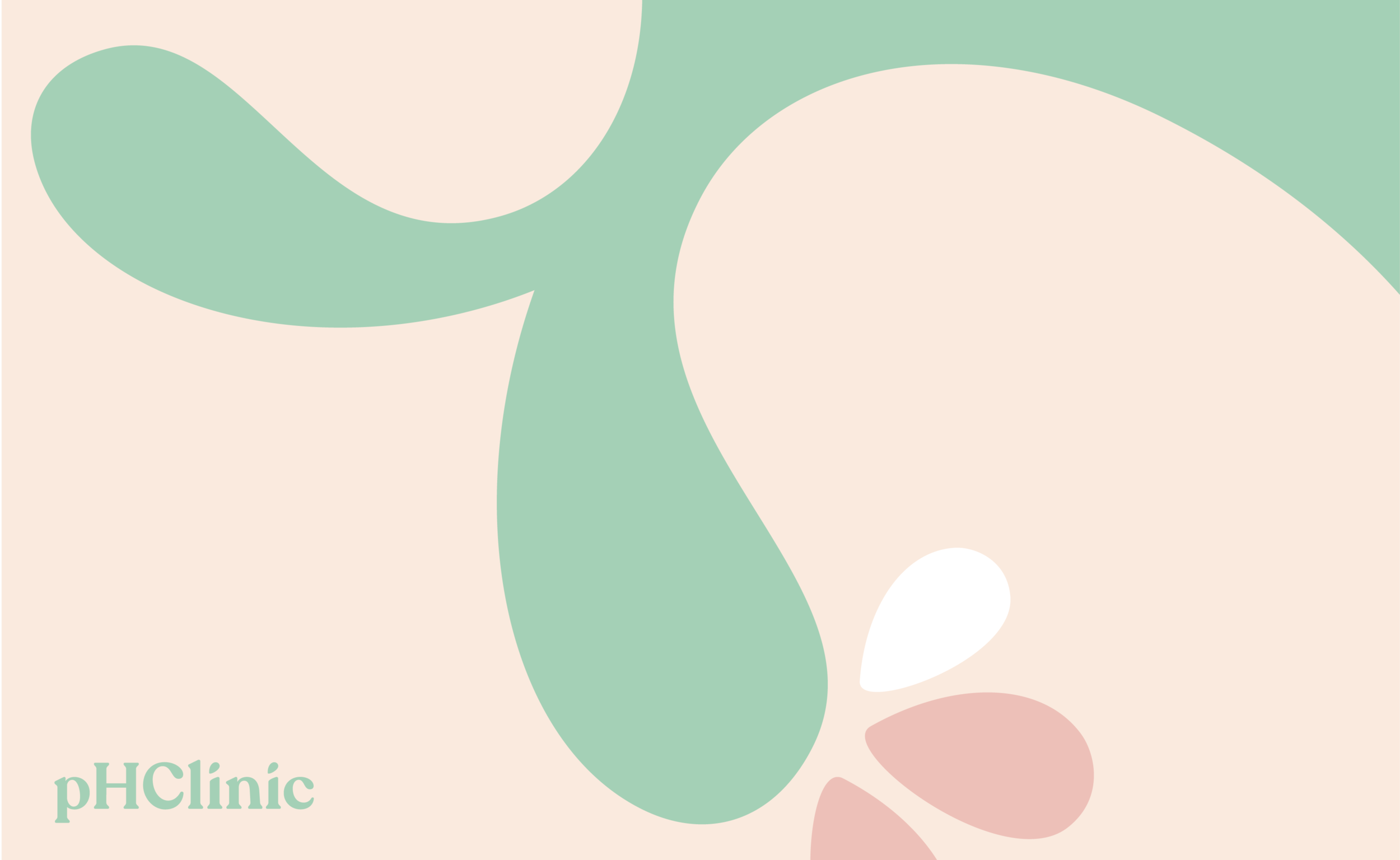
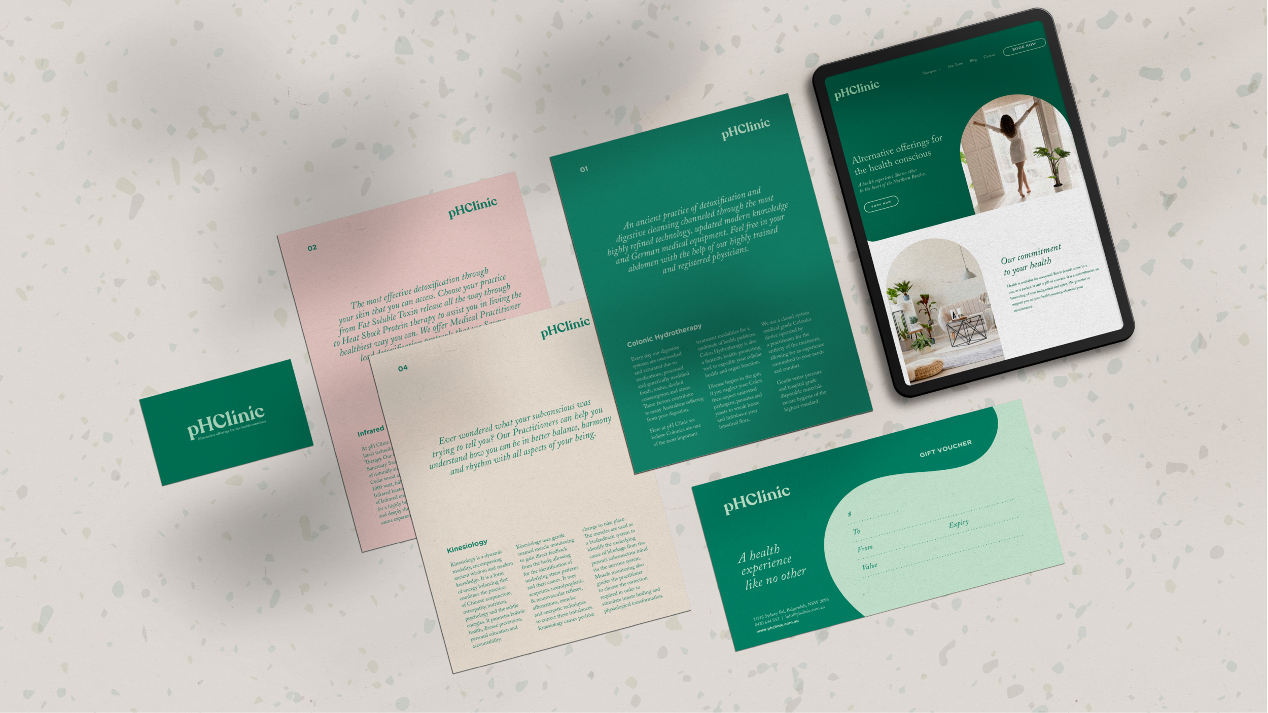
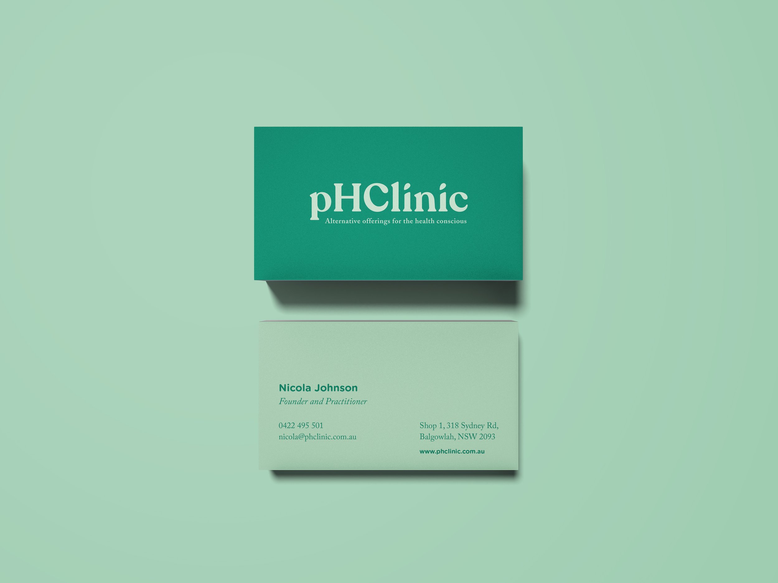
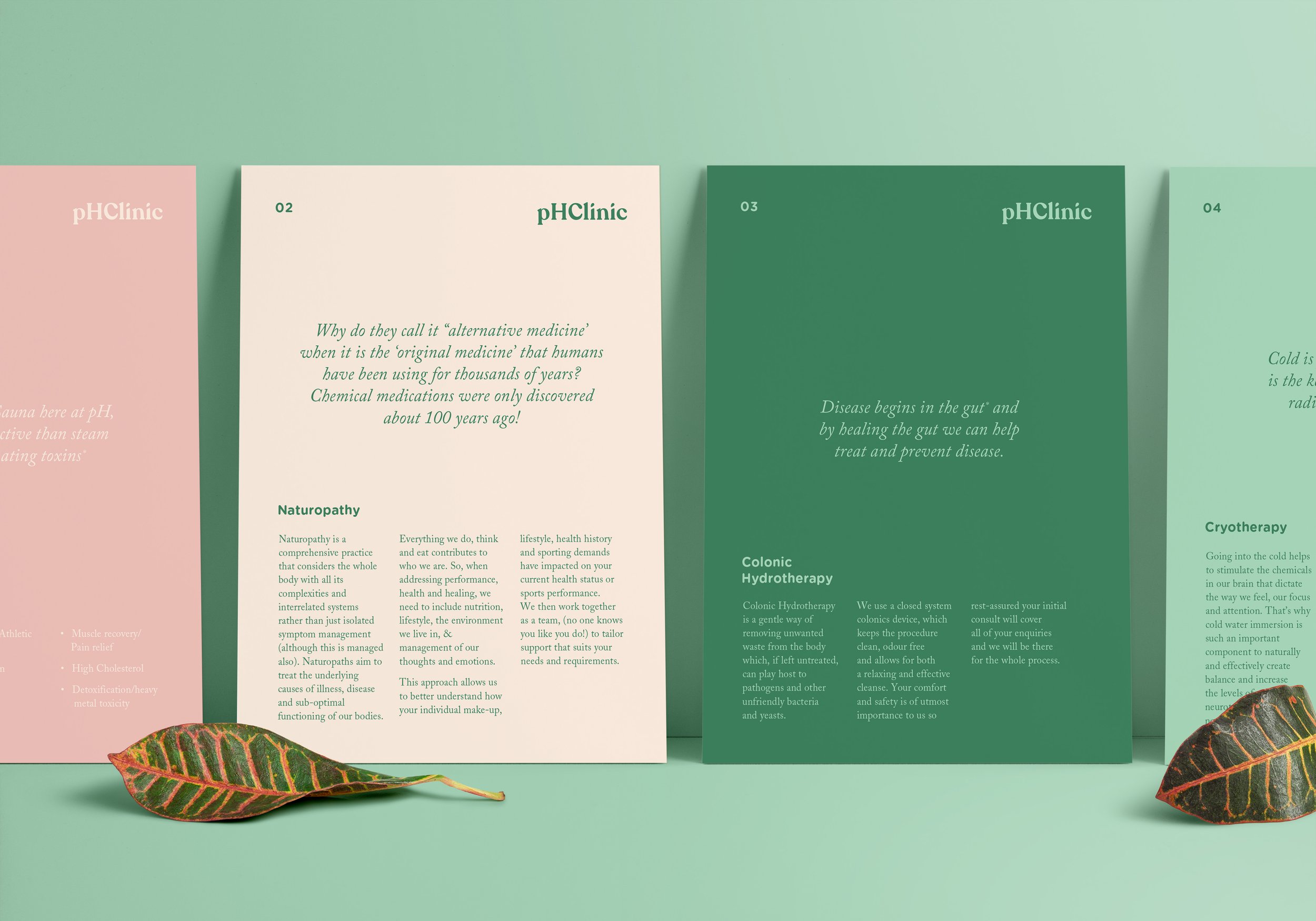
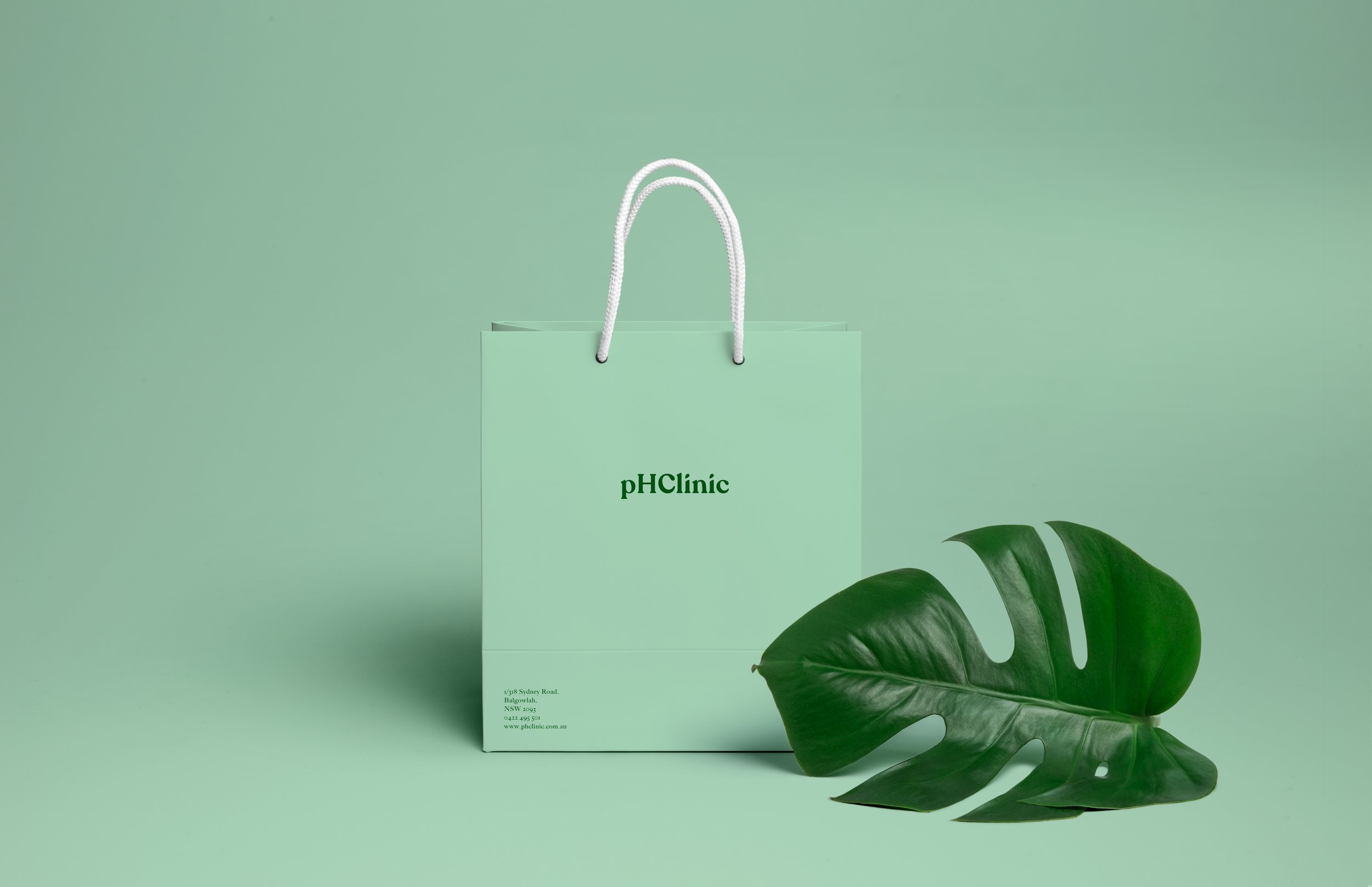
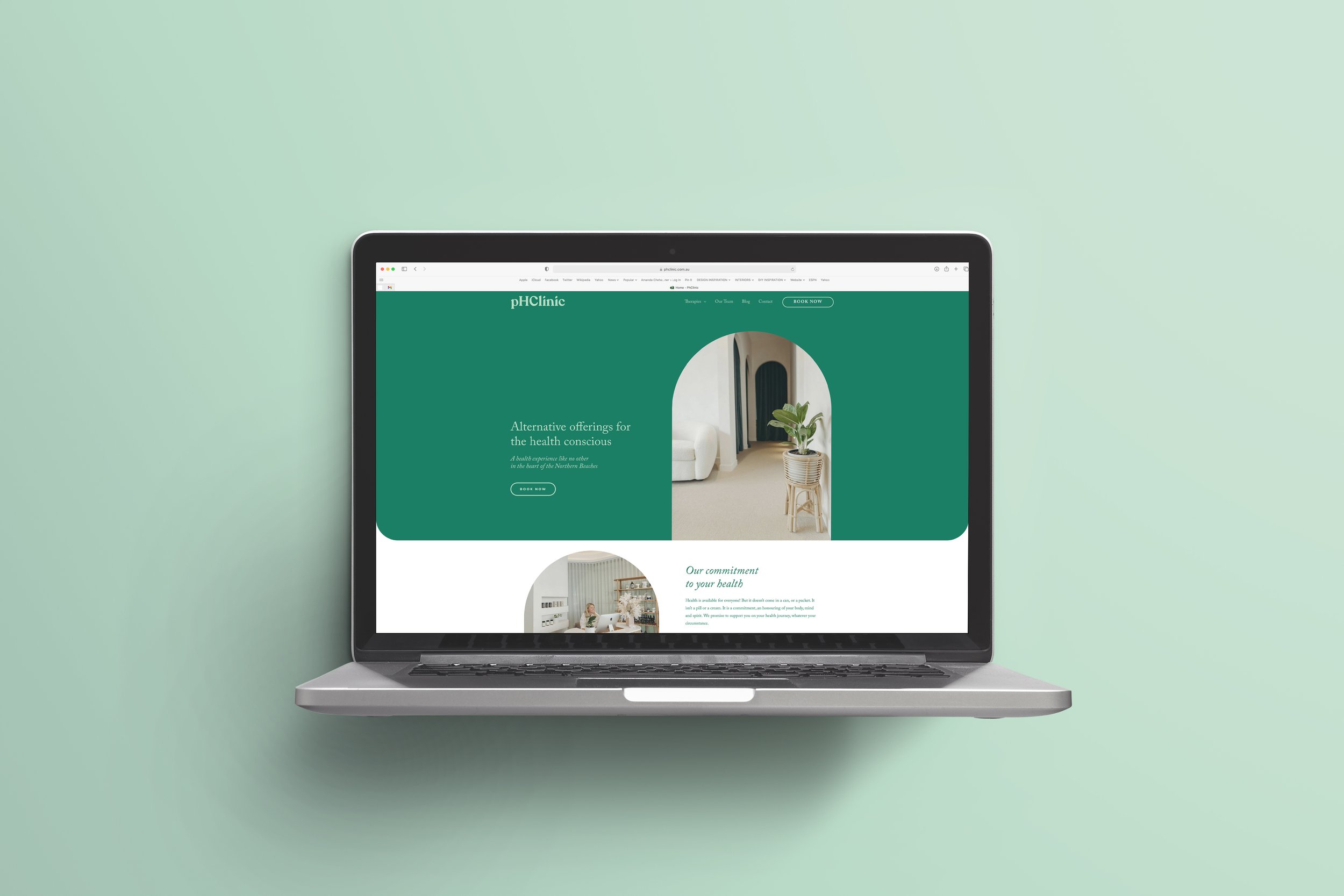
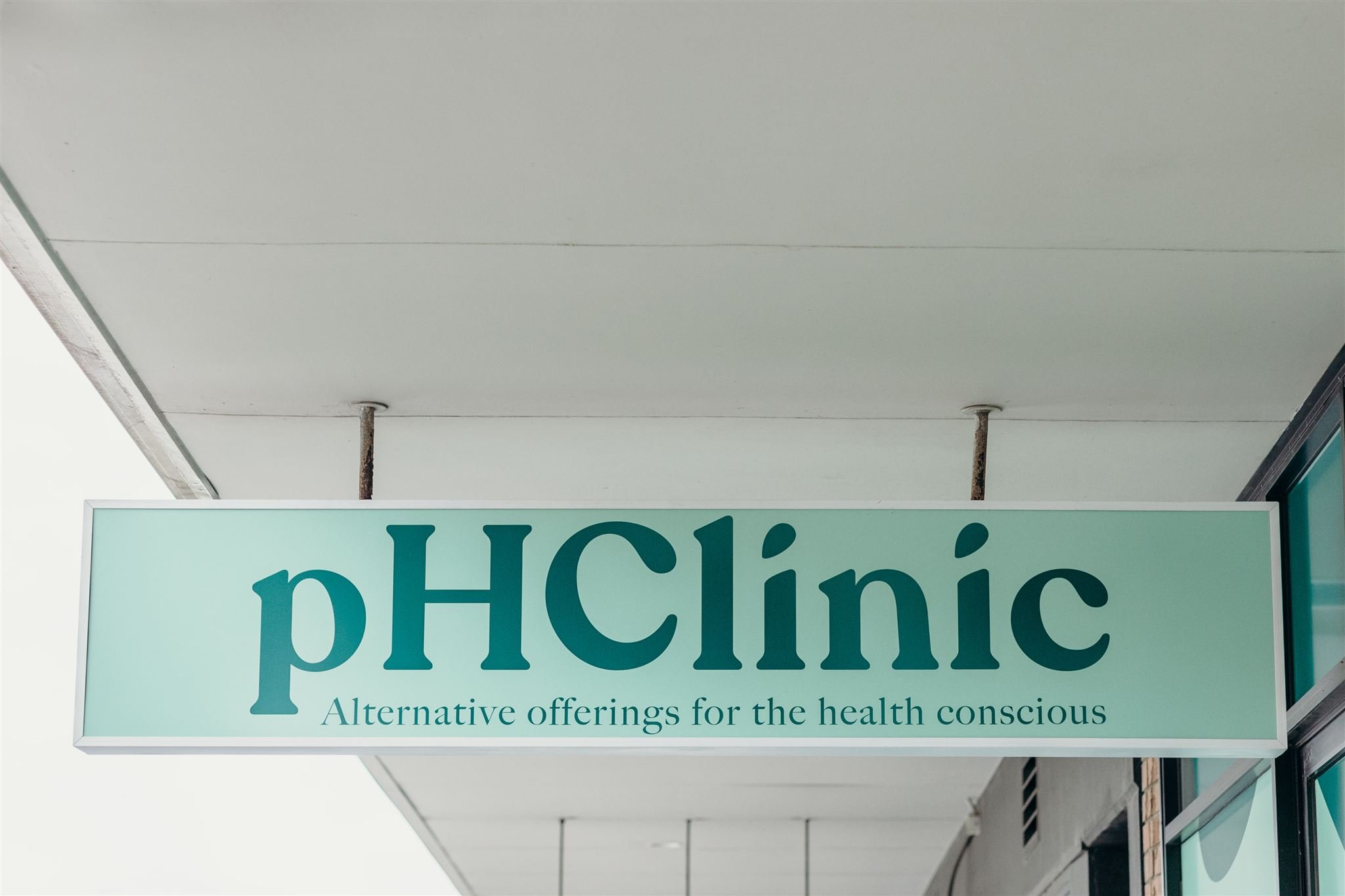
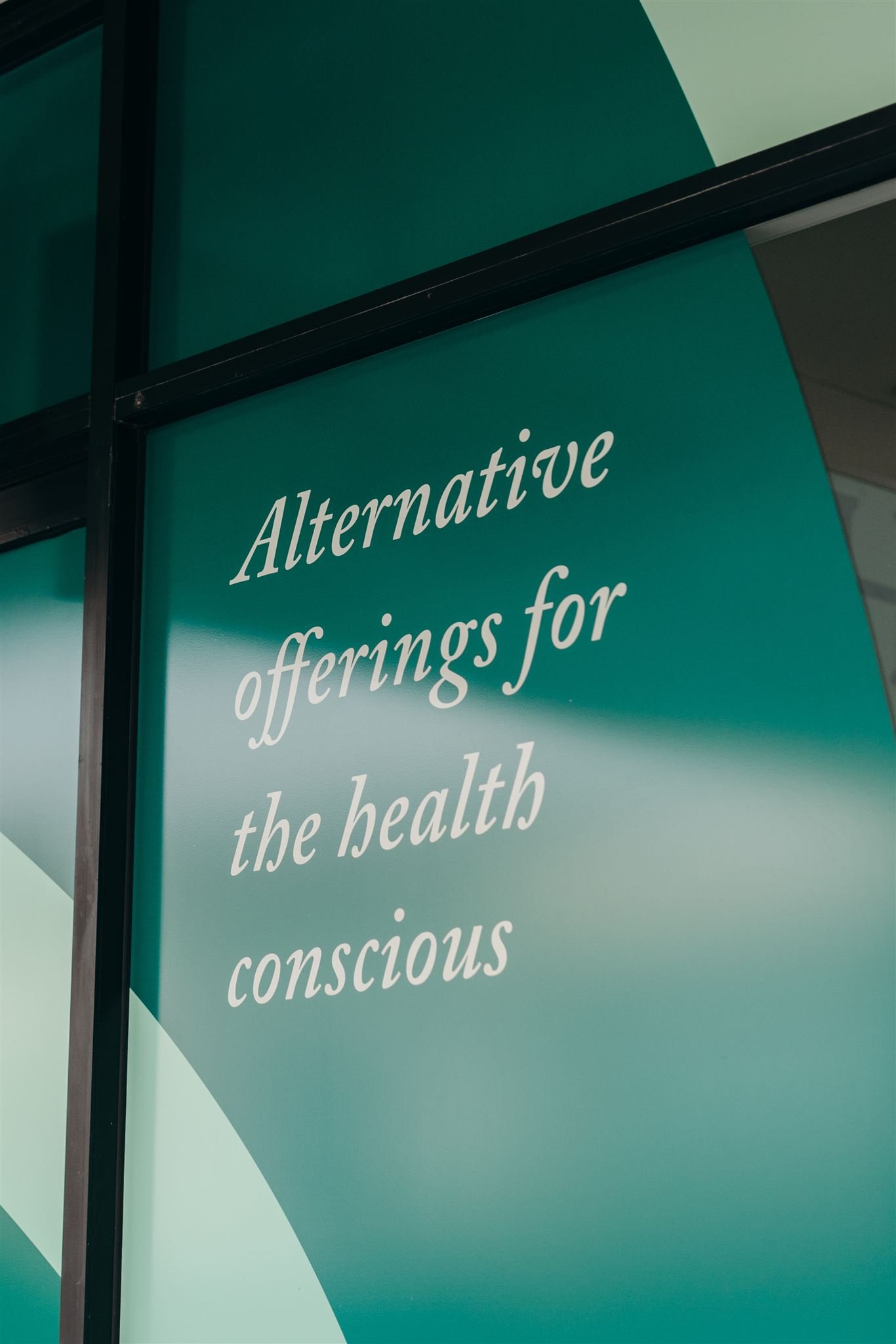
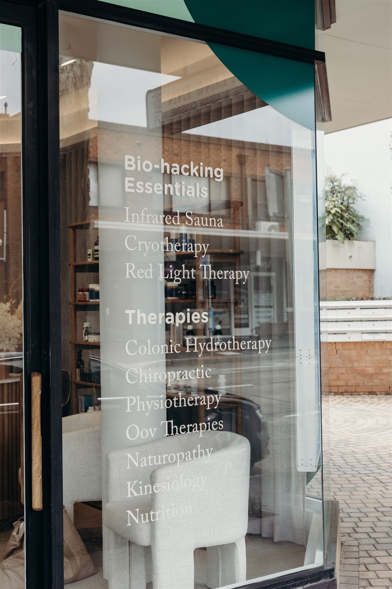
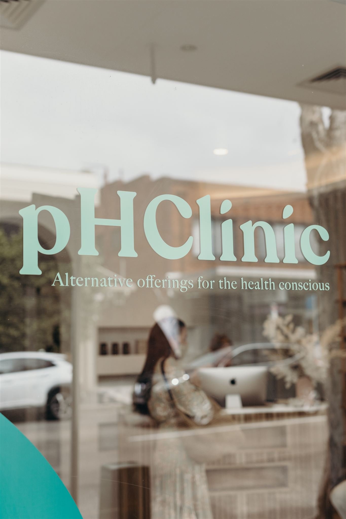
The clinic needed a brand that spoke to its new clientele, without losing those loyal customers who had been with them since the beginning. Their existing mint green was kept for consistency and paired with a deep forest green to bring a new sophistication and depth to the brand. The new bold brandmark uses a soft, curved typeface, which still speaks to it's natural services and friendly nature. The counters on the ‘i’s were replaced with a droplet shape symbolising water + leaves giving a subtle nod to some of their therapies and treatments. The droplet shapes and organic shape of the ‘C’ was also used in large scale across signage to create bold organic shapes.
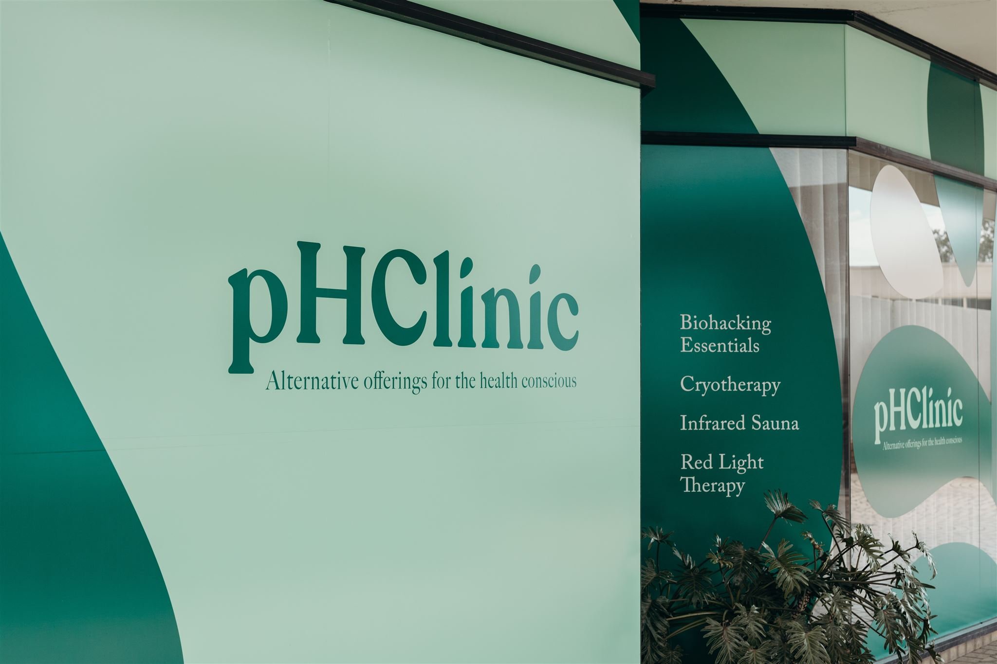
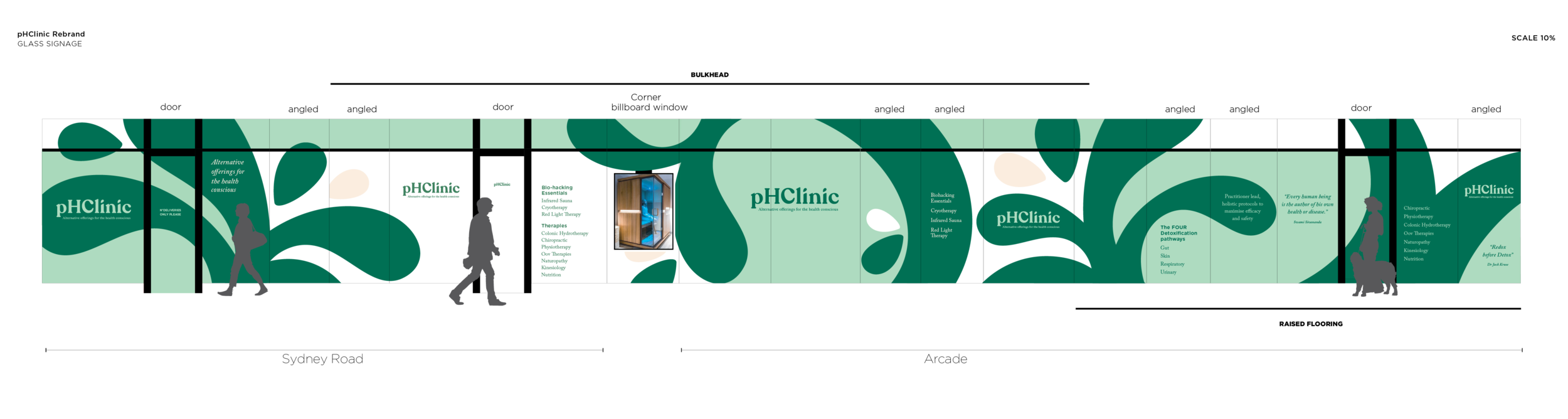
The exterior signage comprised of 42 glass panels, as it was on the corner of a high street and a paved mall.
Many things were considered when designing for these panels;
Creating a branded solution without photography,
Creating privacy for the rooms inside whilst still letting natural light in,
Covering a low bulk head and a raised floor across parts of the interior,
Grabbing attention from the busy high street and providing information.
Credit: Sam Riles Photography
“Amanda created my branding in 2015 when I was in the planning stages of opening my small business in alternative health services. The questions she asked and the process of it’s birth was pretty amazing as I had no idea where to begin with a logo or what I wanted. She captured the the vibe perfectly and pH Clinic was born.
Fast forward 6 years and we were set to move locations and evolve our offering which called for a brand overhaul. I contacted Amanda again and with minimal prompting she created an elevated and more sophisticated version of our existing image AND a whole brand kit to go with it.
Amanda has been pivotal in our brand evolution and journey to date, she has assisted with creating marketing material and other items for printing as well as a social media guide on how we as a business remain consistent with our branding via our online channels.
I can’t find the words to put it exactly but Amanda is a branding and graphics wizard. She’s intentional and calculated but oozes creative flow. pH Clinic wouldnt have the same vibe without this ladys’ input so I thank my lucky stars I trusted her with this huge element of my business.”
Nicola Johnson / founder